Project Overview
Bark Park is a hypothetical public dog adoption event hosted at Cincinnati
parks. The event promotes fun and outdoor activity, while also giving
potential adopters an opportunity to learn more about the dogs in person.
To bring this event to life, a system of informative signage was created
to help potential adopters learn more about the event, and the dogs
that are available for adoption.
Throughout the development of this project, experimentation and
creative development were prioritized through the use of pattern,
typographic layout, and color.
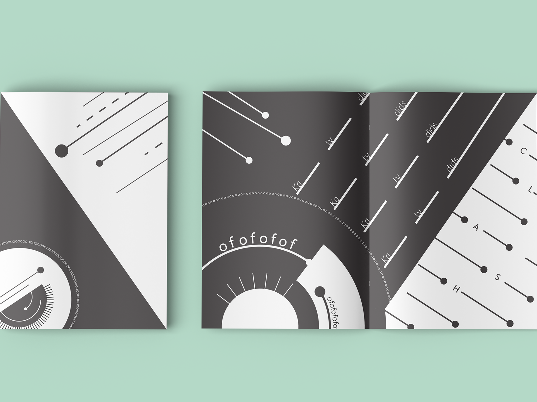
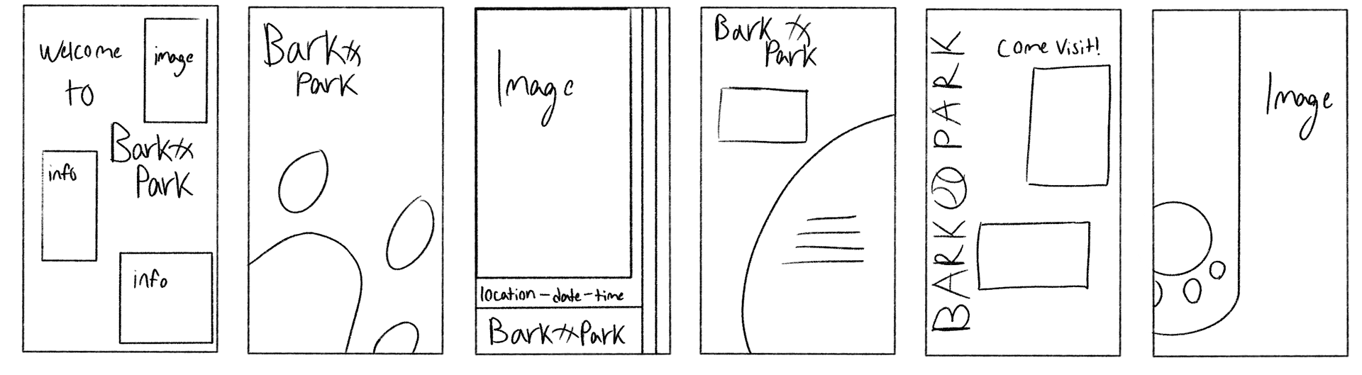
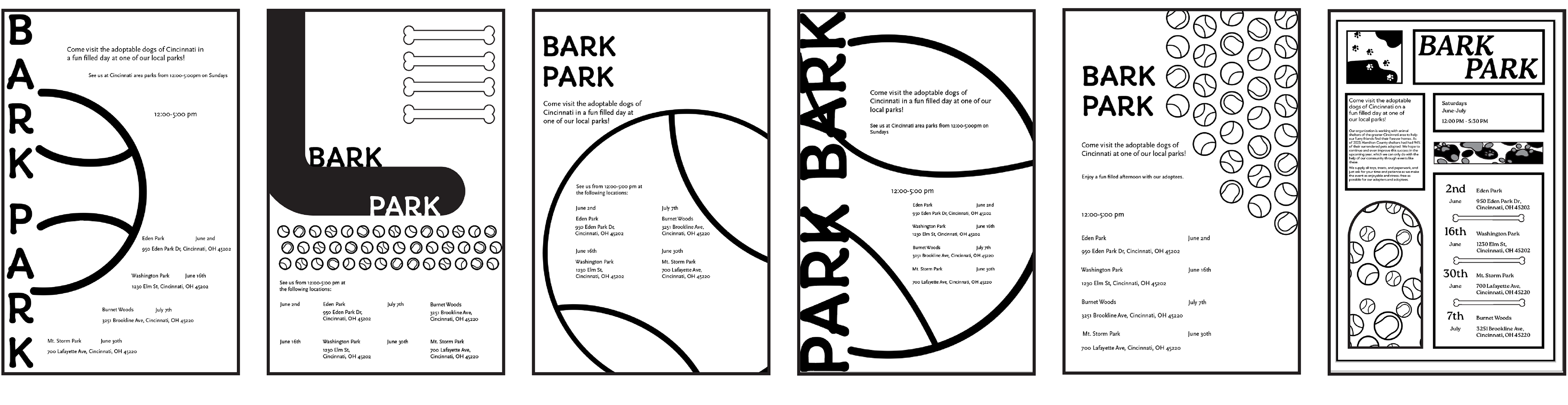
Flyer Sketch Iteration
Initial sketches for promotional flyers for this event explored several
typographic layouts, and what ways space could be broken up to make
the content visually interesting while also prioritizing legibility
Initial sketches for promotional flyers for this event explored several
typographic layouts, and what ways space could be broken up to make
the content visually interesting while also prioritizing legibility
Flyer Digital Iteration
As the process moved to digital iteration, the composition was modified
to fit typographic grids and introduced a set of body text that describes the
event. A major concern in this step of the process was finding a layout
for the date, time, and locations for the event that was easy to find quickly,
but not overwhelming in the composition.
to fit typographic grids and introduced a set of body text that describes the
event. A major concern in this step of the process was finding a layout
for the date, time, and locations for the event that was easy to find quickly,
but not overwhelming in the composition.
Experimentation with design elements like shape and pattern was also utilized
to help frame the information and draw the reader's eye throughout the flyer.
to help frame the information and draw the reader's eye throughout the flyer.
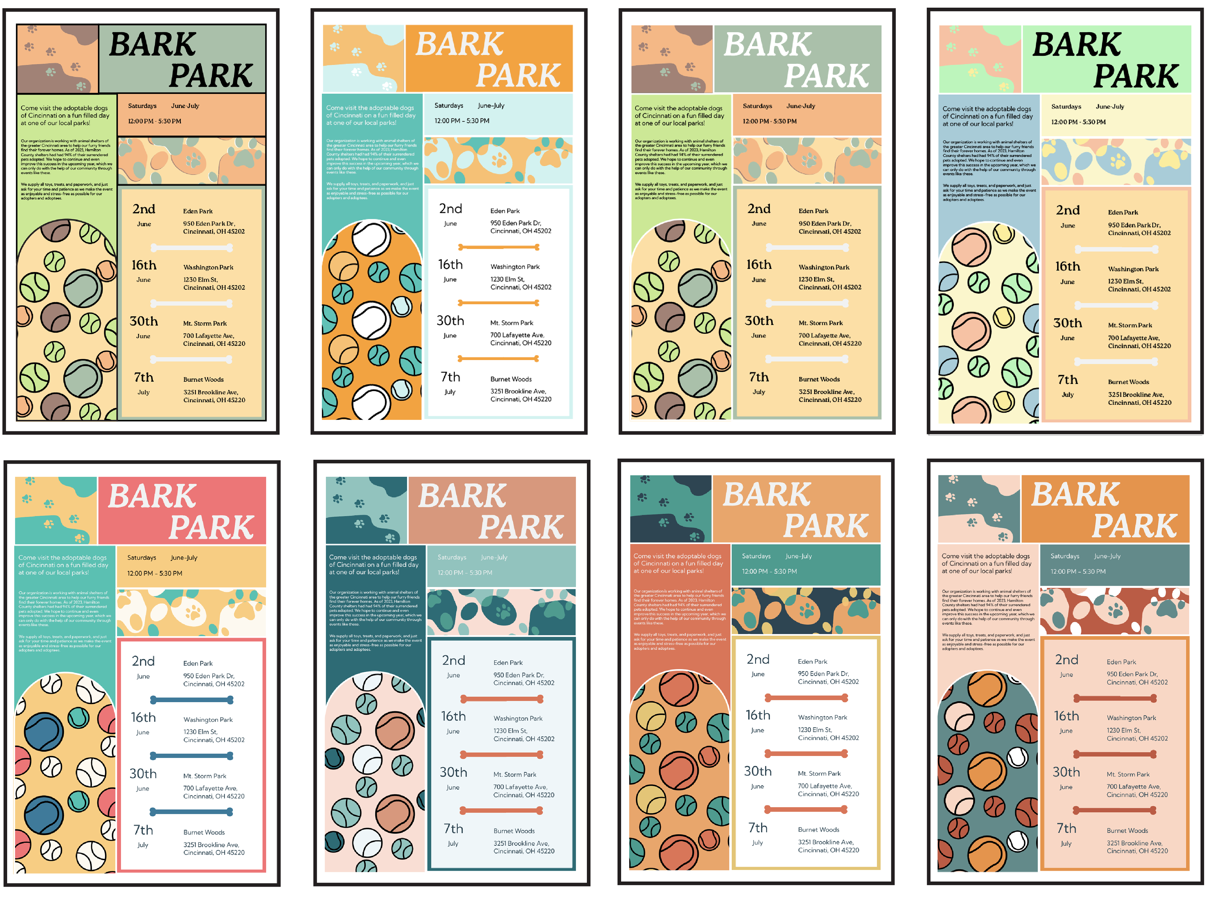
Flyer Refinement and Color Iteration
Despite the often negative associations people have with animal shelters,
dog adoption is a very exciting event for all parties involved. To reflect this, the
refinement process experimented with brighter, summery color palettes and casual
sans-serif fonts to create a sense of ease, fun, and excitement.
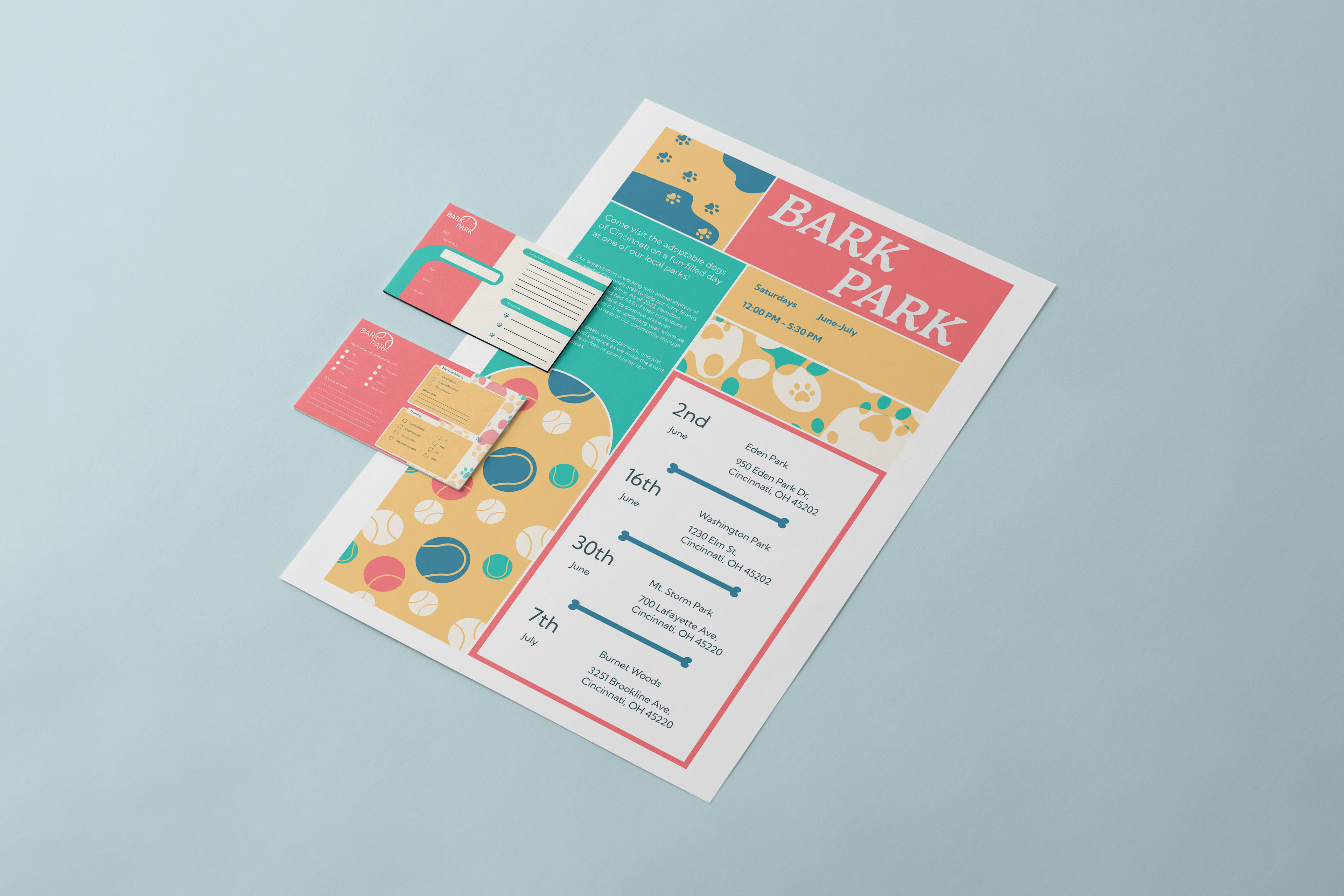
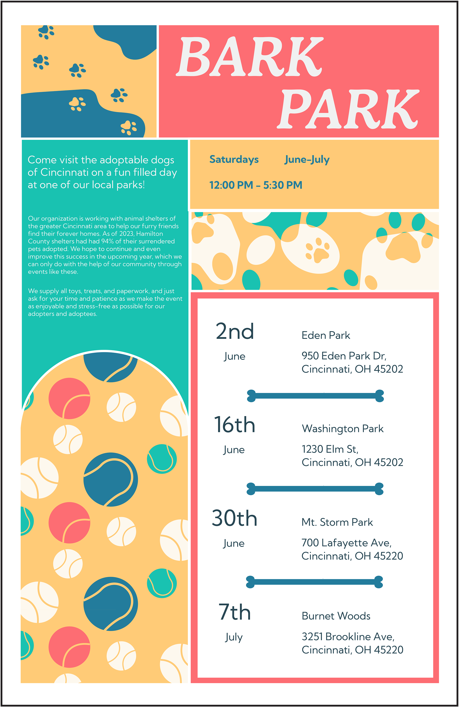
Final Flyer
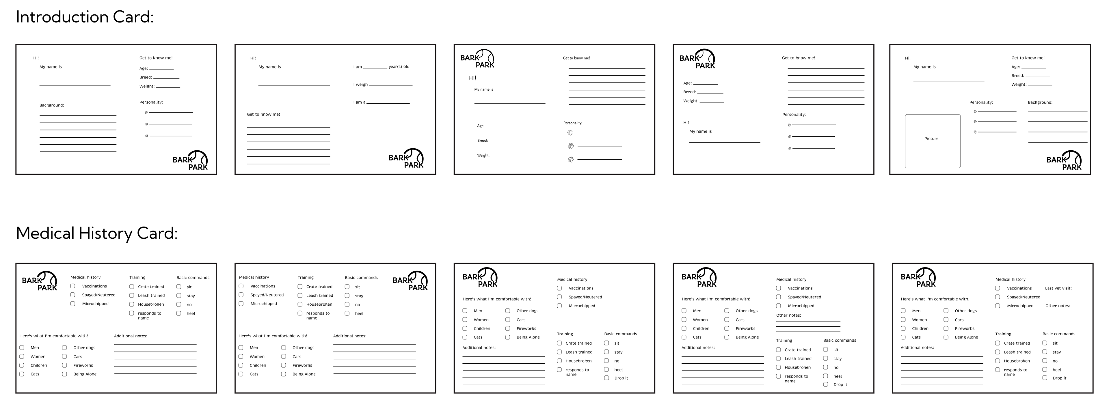
Kennel Card Iteration
Every dog is unique and will have a different story as to how they came to the
shelter and what their perfect forever home looks like. To best communicate their
stories to interested adopters, a set of kennel cards needed to be designed that
describe essential information about the dog’s attributes and needs.
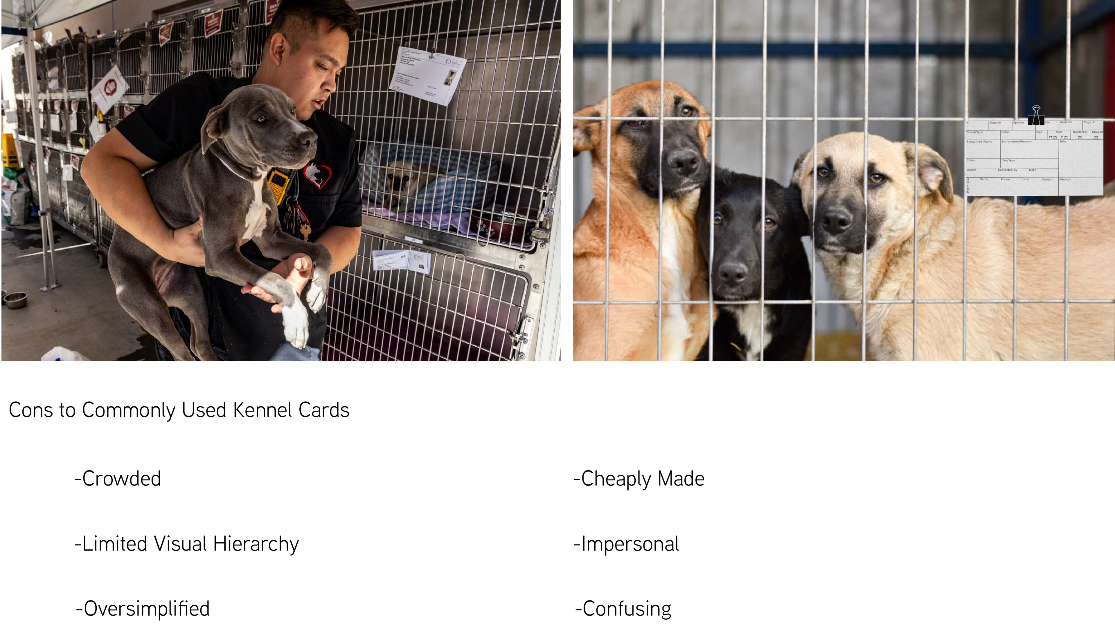
Most kennel cards are very lifeless and plain, and lack visual attributes to support
the adoption process. Bark Park's branding brings a more positive association to
the adoption process, so the kennel cards must reflect an enthusiastic energy while
also creating an effective visual hierarchy.
the adoption process. Bark Park's branding brings a more positive association to
the adoption process, so the kennel cards must reflect an enthusiastic energy while
also creating an effective visual hierarchy.
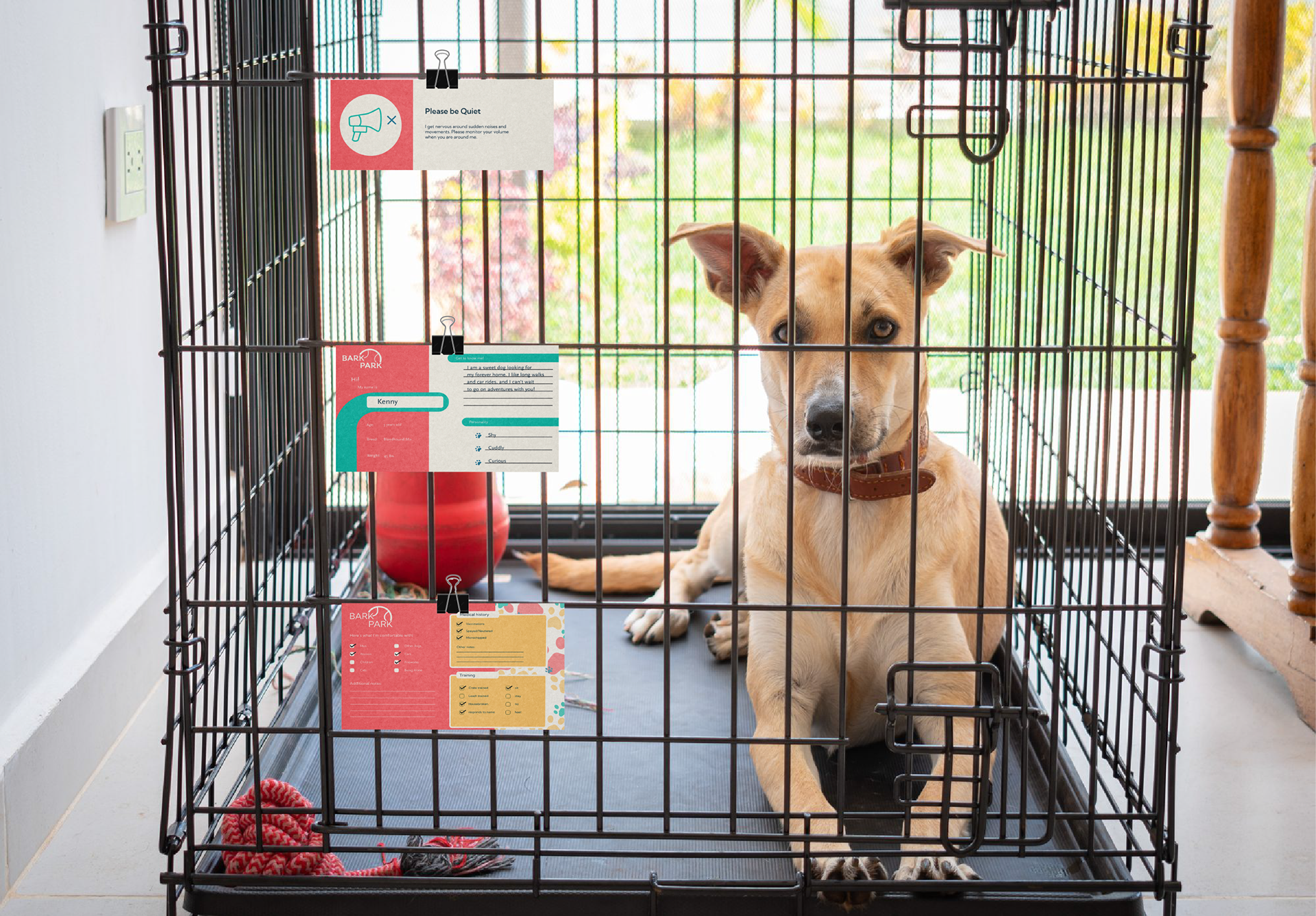
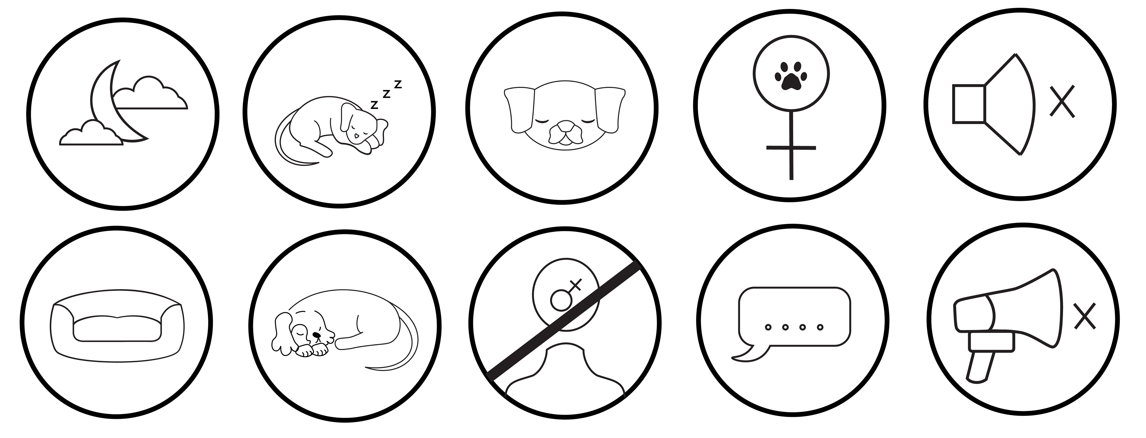
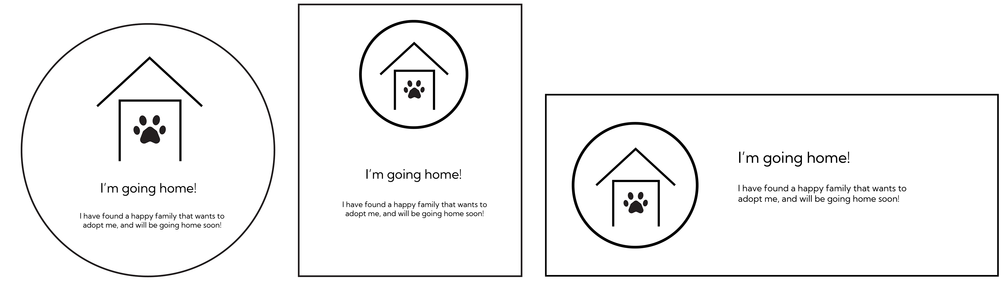
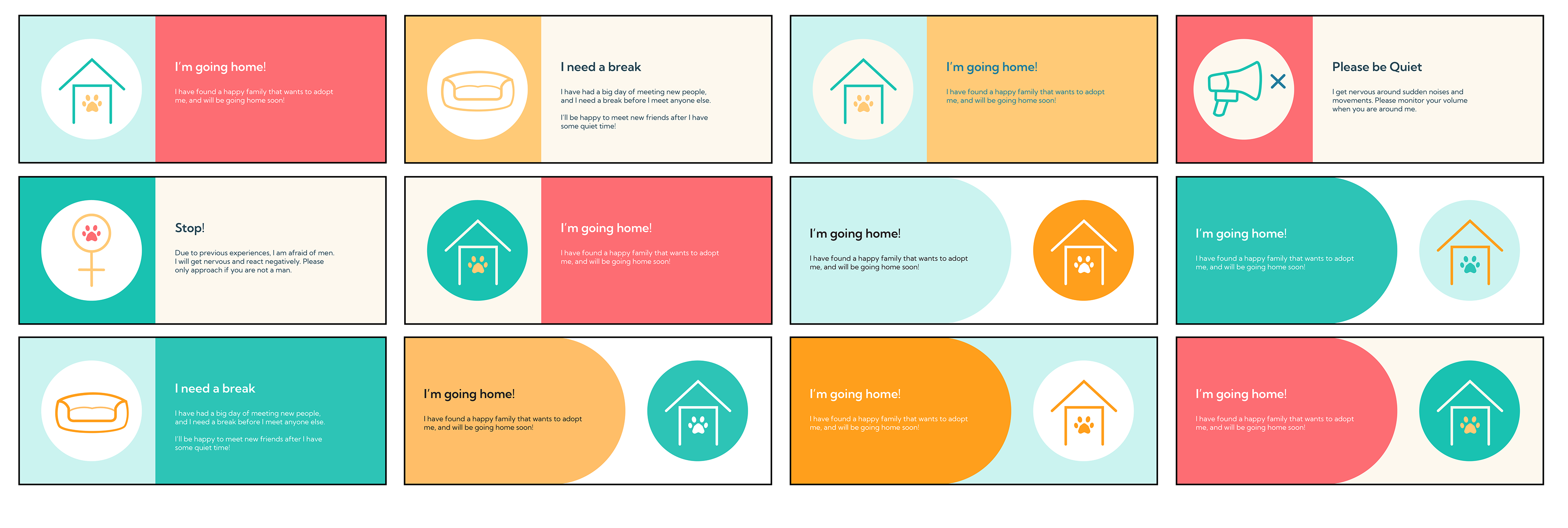
Kennel Card Iconography
Due to the nature of this event, it was important to include supplemental
cards that contain essential or more immediate information. For example, dogs
that participate in this event may get overwhelmed and need a break from
human contact, or may have already been adopted. To prevent potential issues,
additional warning iconography was created to be placed on cages for
more immediate communication.
Kennel Card Refinement
To create a sense of continuity between the designs in this project, the
color palettes used for the kennel cards were created based on the color
palette used for the flyer. Throughout the ideation process, variations of
color blocking were used to accentuate the previously established typographic
hierarchy. Pattern and lineless shapes were also introduced to help draw the
viewer's attention throughout the entirety of the card.
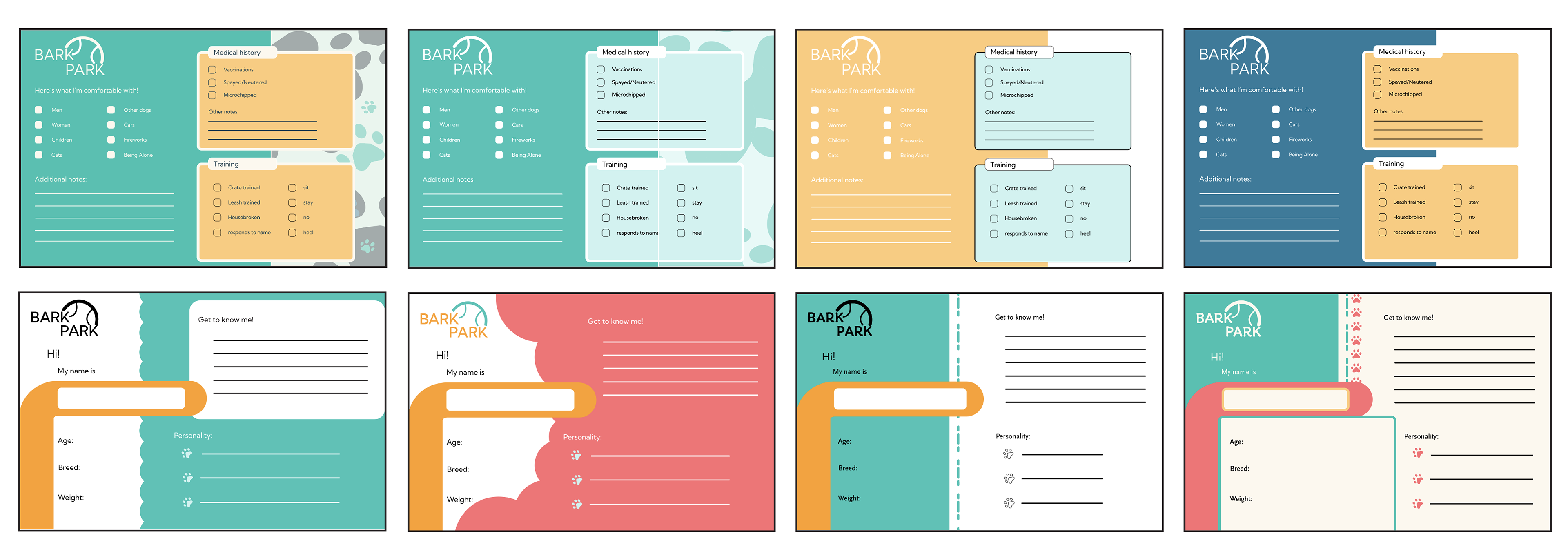
Kennel Cards Final